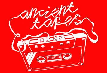
 Bands and Brands: How to Logo by Ian Duggan Think back to many of the big music artists from the past – AC/DC, Metallica, Kiss and Motörhead, The Rolling Stones, The Sex Pistols and The Ramones, Wu-Tang Clan and Run DMC – and you can probably picture the logos many of them use. You see them on their albums and adorning the t-shirts of their fans. While band logos seemingly are not so common now as they used to be, a number of bands still do have them, including a few from Hamilton (or related). I talked to Andrew Carter of Deathnir, Gareth Schott of Ancient Tapes, Tim Fowler from Ghosts of Electricity and Julian White from The Scones, four bands with branding, about their logos; what is their purpose, what are the advantages of having one, and how did they go about getting one? HUP: Andrew, being in a metal band, unlike the others, a logo seems to be a given. All metal bands seem to have one. Do you think that is a fair assessment? Andrew: I think when it comes to logos it is fair to say most metal bands have one, at least bands with credibility or experience. Metal bands like to stand out so these days it is common to have intricate and even complex designs. I don’t know if it’s as important to other genres of music but in metal it is pretty much essential. HUP: Do you think there are any advantages in having a logo? Tim: I think the biggest advantage is just as a time saver. Once you've got one, that's the last time you need to talk about it. I've always been pretty keen on trying to minimise the amount of time I spend doing the non-music aspects of being in a band. Andrew: There are definitely advantages to having a logo. The first is obviously to make your band name stand out on a poster. For instance, look at all the ‘big’ bands on festival posters as opposed to the smaller ones. Big bands tend to have a logo whereas smaller bands are sometimes compiled as a list in basic font. Half the time you don’t even read the font, you just look at the logos. Another advantage is to communicate the kind of music you play. If it’s a twisted, detailed, demonic looking logo, then it’s probably black metal. If it’s bold, basic and colourful then it could be reggae. If it’s Times New Roman nobody has a clue except by what the band is called. Julian: I think there are advantages, in affording instant recognition to those in the know. I find it hard to think of many at the moment, but the really great ones like The Rolling Stones, Dead Kennedys and Ramones are iconic in their own right, regardless of what you think of the music. HUP: Gareth, I notice that Ancient Tapes have been through a few logos, rather than sticking with one. What were the motivations behind getting and using a logo? Does it matter if you chop and change, or do you see advantages in having consistency? Gareth: I don't think we deliberately set out to have, or create a brand. There was no board meeting as such, but the visual side of things are important to me personally. To advertise gigs and events, you need strong imagery. We don't desire to have images of us out there. So, I guess our logo and associated images are the next best thing. I think of how bold the band name of RIDE is on all their records and as a backdrop to their live shows. Simple font, but nevertheless classic. Same with Blur and Oasis to some extent. They have been consistent, whereas I have loved the way The Cure have changed the way the band name is represented. They have definitely turned their band name into an art form. Julian: To be honest, I'm not sure a single logo is essential. It does have the potential to limit creativity if you feel you have to. I quite like what They Might Be Giants do, which is to have all sorts of different ways of representing their name, and different emblems. Tim: I think I just wanted consistent branding across anything we'd be putting our names on, like CDs, posters, etc. Just for easier recognition. I also remember having conversations about what font we should use on posters. I can't stand conversations about fonts, so I figured if we had a logo, we didn't have to do that anymore. HUP: Gareth, with Celebrity Death Hoax (in contrast to Ancient Tapes), you had a consistent logo with respect to the font, but changed the images associated with them. I assume those were your designs also? Gareth: CDH was all me, yes. I sort of liked the visual potential of that band name. Almost like Gorillaz, where the artwork is equal to the music. HUP: What was the inspiration behind your designs? Who did the designs? Andrew: Our logo wasn’t really inspired by anything except that we didn’t want to look like a death metal or black metal band — with crazy fonts you can barely read. We wanted something more basic but pointy like Metallica or Megadeth. Basically, we wanted something original that looked cool but was still practical. That’s about it. Our logo was designed back in 2013 when we first started. It was something we knew we wanted from the beginning, and two of our members at the time had experience in graphic design, so we made it ourselves. I worked with the drummer at the time to form the basic final concept. We produced at least ten options that were all vastly different. When we were happy our other member took the design and made it in full HD which became our current logo. Tim: I can't remember exactly how I came up with it. I think I just doodled stuff until I came up with something I liked. I found out later a shop on Ponsonby Rd uses the same concept of circle-ish letters spelled out with the same shape, but I can't remember what they are called or what they sell, which kind of expresses the power of a logo. I came up with the concept of the logo but I'm pretty crap at drawing. I think I got a graphic designer to do it. Gareth: Initially our first font was selected for us by Louise Hutt, who also did the Hummingbird EP cover, but since we've reformed I have done most of the band stuff; HUP posters, tape and t-shirt design. We found that our initial one was too thin, plus we wanted to signify a change in direction and new era (personnel), so I moved it on from what we started with, which was classic shoegaze dreamy imagery.
Julian: It was when we were still a three piece. I had t-shirts printed off for each of us with a photo of a scone (which I had baked myself). They were the only ones ever printed to date. They weren’t particularly popular with the other band members, or anyone else for that matter. We were going to play a gig, and [drummer] Mike [Paterson] thought it would be good to have something to sell, and a t-shirt is good as it is so visible and portable. So, he came up with what might be considered the logo, which is simply our name in a bespoke (I think) font, a long upper limb on the S and the O in the shape of a scone. I don’t know that it was considered at the time to be something that would have much longevity apart from being on the t-shirts. Of course, it has now also appeared on our first EP, pens and one prototype mug…
0 Comments
Leave a Reply. |
Archives
July 2022
Categories |
 RSS Feed
